Is there an end in sight for the persistent underperformance of miners compared to gold? Calibrating once more the regression parameters has added another match initiating at Valentine 2024, when gold finally broke above $2000 onto its ascent to the recent all time high.
HUI – Gold regression.
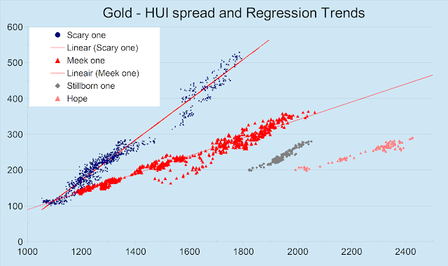
When plotting the HUI index relative to gold, time is eliminated. On a long term series, we observe all previous regression relationships. The lengthy periods in between, with miners lagging the gold price, have been left aside. Lately a ‘new’ regression relationship seems to be emerging.
 |
| Successive Regression Trends in a HUI versus Gold scatter graph |
The 2012-2017 regression was labelled “the scary one” because it coincided with gold sliding, followed by the 2016 failed break-out. Obviously this regression predicts much higher HUI values for any given gold price. This relation was invalidated during 2017 while gold rallies were breaking upon the $1350 boundary.
Note: Gold prices are NY Comex close at 5 pm. HUI values are at stock market close at 4 pm.
The ‘meek regression’ emerged in 2018 in March or August according to the correlation threshold chosen. This regression withstood the challenging Corona plunge, the subsequent gold price spike during the summer of 2020 and the ongoing financial largess in 2021. The FED speak focused on transitory inflation because of budget deficits amidst a productivity reduced by Corona lock-downs. In the summer investors grew wary as the FED finally planned to wind down QE. Though gold upheld $1700 in the autumn of 2021, miners gave way. Even the ‘meek’ regression came under strain.
Gold would eventually end 2021 at $1830 only little below its $1898 level by end 2020. Instead of a benign 3.6% weakening of gold, miners slid 13.6% over 2021. With gold flat over the challenging year 2022 miners nevertheless lost another 11.2%, making the regression fail.
Amidst the gloom, the dust settled over 2023 and inflation threats seemed to be waning. This has perhaps been why a nascent regression emerged. The candidate pointed out in grey predictably is well below previous regression line. We only had a set of 170 points aligned, stretching from March 15 till end of October 2023. Despite the short HUI and Gold ranges, the stillborn regression correlated at 0.91.
By end 2023 it was obvious that the regression relation had gotten under strain, eventually breaking down early 2024 with gold hesitating to choose direction.
On Valentine day 2024 gold last quoted below $2000/oz breaking out the day after and starting its ascent to the May 20 all time high, north of $2425. Not surprisingly, the HUI followed suit, whereby a new linear regression showed up. Yet another ongoing regression candidate with parameters:
HUI = 0.216 * ($Gold – 1096)
The correlation coefficient stands at 0.94, despite the short time horizon. Corresponding dots are set in salmon reddish at the right. Will this regression hold? If so, it will be labelled ‘hope’. The longer gold keeps range-bound between $2275 and $2350, the more probable the regression candidate will eventually fail; we can thereafter relabel it ‘deceit’. Unfortunately no regression failure is ever to the upside: miners always resume lagging gold.
Synoptic graphs
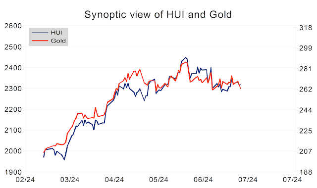
In a synoptic graph, the axis for the HUI (‘dependent variable’) is modified to reflect the linear regression as derived. The HUI estimate as determined by the gold price is then compared to the real observed HUI value. The difference is a regression error. Squares of regression errors are minimized. Regression errors need to change sign frequently for a regression to remain unchallenged.
The new synoptic graph looks like this:
 |
| Synoptic view of the gold price (left axis) and also the HUI regression estimate (red, right axis) while observed HUI values are shown in blue on the right axis. |
This is how the synoptic graph of the stillborn regression looks well over 8 months after it first got challenged.
| Synoptic view of the gold price (left axis) and also the HUI regression estimate (red, right axis) while observed HUI values are shown in blue on the right axis. Despite the optimal regression over its short validity range, the synoptic graph was challenged from November onward. |
HUI – Gold long term graph
| Very long term graph of gold (red, left axis) and the HUI (blue, right axis). |
Miners are poor investments as compared to gold over the very long term. This is well illustrated by the above ‘secular’ graph showing the HUI index and gold since 1996. Over the very long term, there is barely any progression for the HUI over its 28 years covered. Meanwhile gold has more than quintupled.
The new regression line once more ‘predicts’ lower HUI index values for any given gold price than any previous regression did. This should remind mining investors that ‘leverage to the gold price’ (often called ‘optionality’) generally holds over a short to medium time frame, but certainly not over decades.
‘Optionality’ definitely is a sell-side analysts’ argument. It sounds as one of those fancy concepts designed to lure less informed investors into jumping on the bandwagon of an ongoing miner bull market.
Yet another conclusion of the above graph is that you cannot diversify away specific mining risk buying any miner ETF. Both GDX and (even more) GDXJ lag any gold bullion ETF as GLD more or less to the extent that the HUI index lags the gold price.
Few individual miners keep up with the gold price over the long haul. Even expert picks have a hard time realizing any decent profit over the long haul: what is the fate of most individual investors is more or less obvious.
